Notice anything new?! RedZone has spent part of this off season revamping its website and logo. These changes are very exciting for us, as the company approaches its 20th year.
We are very thrilled to announce the new website launched this week, ahead of what will likely be another busy fire season. It is very important to us that our website matches our core values to continuously improve and love process.
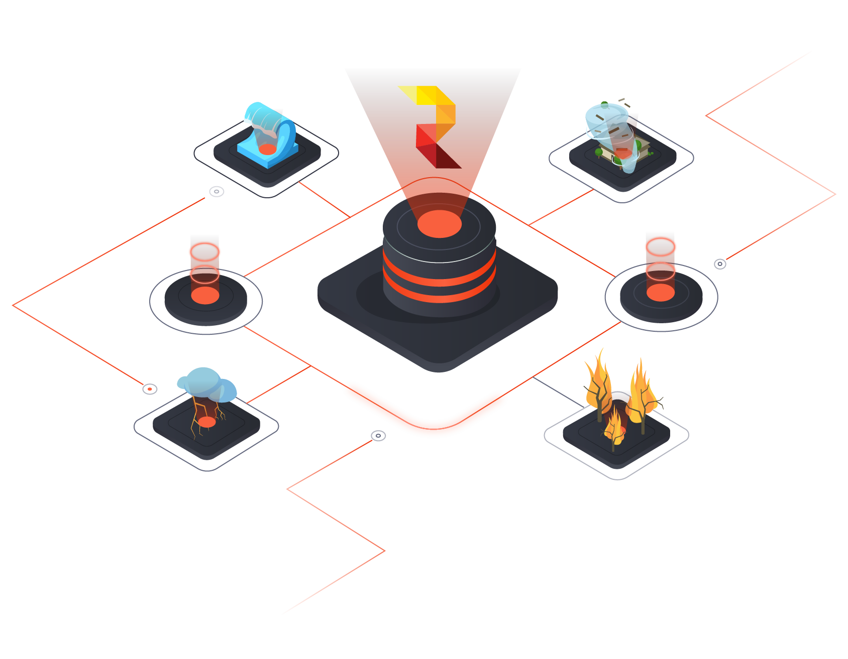
Therefore, our goal is to offer a simplistic, but interactive way to learn about Redzone’s expertise and services. It offers better access into our main solutions, RZ Alert and RZ Risk. Additionally, the website now provides use cases, a look into what our clients have to say about our products. This feature breaks down how RedZone is helpful in multiple roles of insurance including, brokers, risk managers, claims, portfolio managers and underwriters.
Redzone.co highlights our innovative partners, who lead in geospatial analytics and data enrichment.

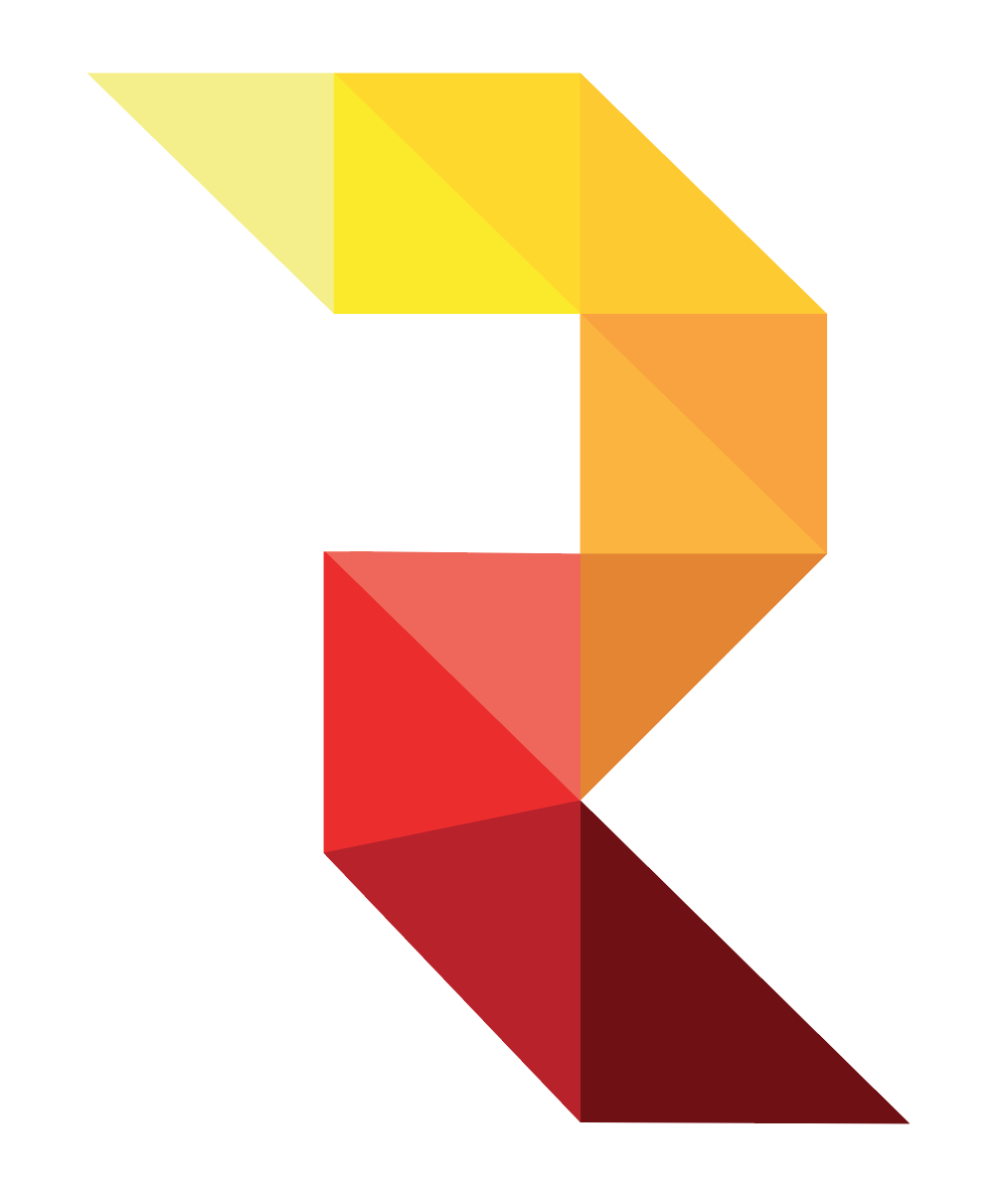
RedZone is excited to announce a new logo as well. We hope the new modern, but simple design speaks to our company’s mission to give client’s accurate, insightful, innovative solutions.
New
Now, RedZone’s logo features a distinctive “R” in honor of the company, with a warm risk gradient color scheme as a tribute to our wildfire knowledge and history.

Old
RedZone’s logo featured a world-like shape, signifying a broad take on risk.
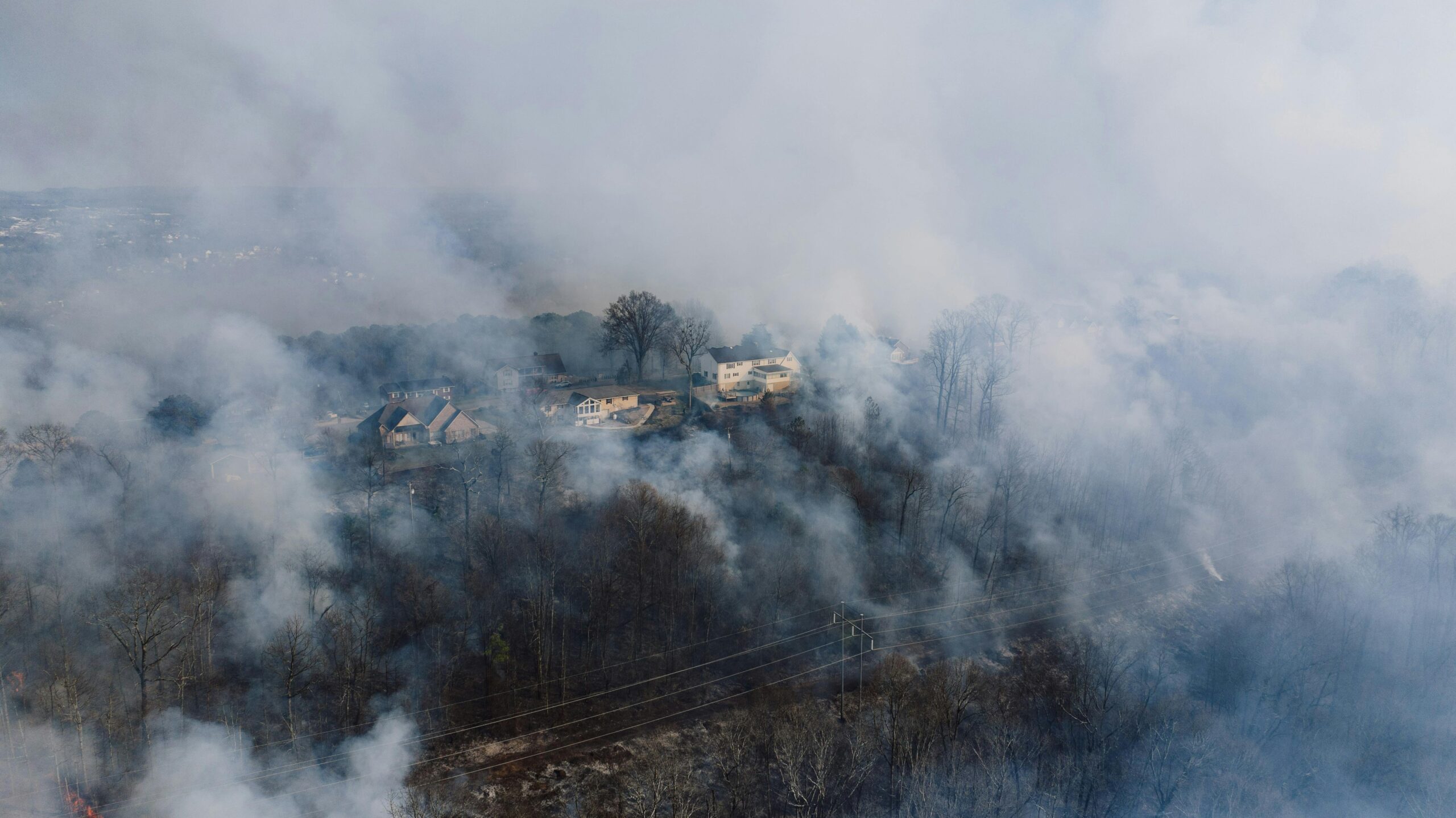
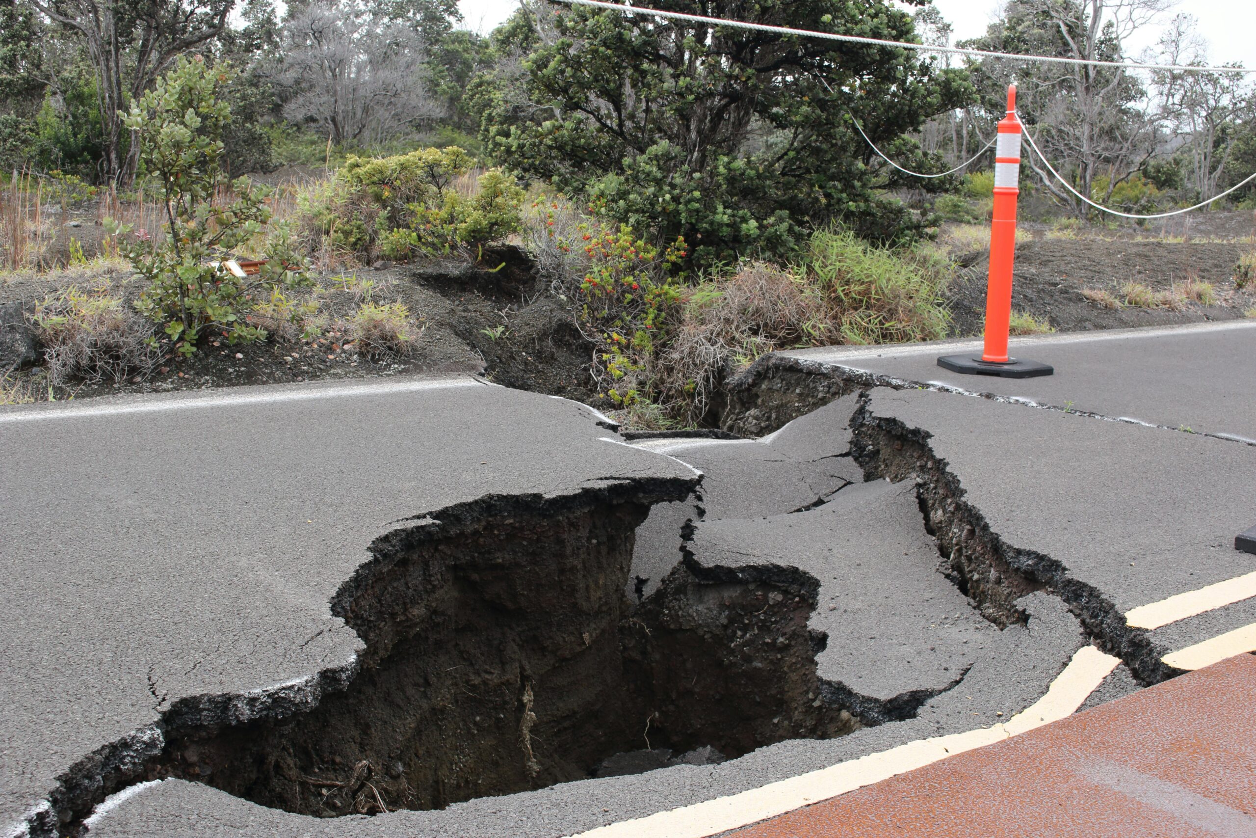
Multiple color schemes are available to represent how RedZone encompasses all hazards. Wildfire will continue to be our core-focus. However, RedZone also works in numerous perils including, hurricane, earthquake, and severe weather.

Click around! We hope you enjoy our new look and learn more about RedZone. We welcome any feedback, comments or questions.

